Hosted by The Broke and The Bookish!
2. SOMETHING LIKE NORMAL: This cover should have used a close-up on dog tags, without the kissing couple. It would have fit the story more.
4. BORN WICKED: Back to the original (left image). The redesign is a bit too typical for my tastes, and I wish I could change the covers back!
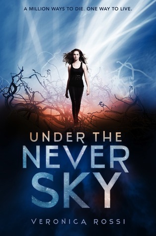
5. UNDER THE NEVER SKY: Great book, meh cover. Awesome title font, though. I think I would love this cover if it didn't have a person on the front.
6. BLOODLINES: Hello, awkward-photoshop-close-up-on-faces cover. The only good thing about the covers for this series are the cool tattoos. Maybe covers focusing only on the tattoo/symbols?
7. VAMPIRE ACADEMY: Big-close-up-face! Ugh. The current redesigns are slightly better, but I still think they should get rid of the faces and do something more symbolic (like using the molnija mark or something).
8. TWEET HEART: Maybe something like a Twitter feed? I'm not sure.
9. DECEPTION: This cover is so unfortunate (fun story, though). Perhaps a shot of an eerie house?
10. SHADE: The original and the redesign do not quite capture this story. I have no idea what would work, but neither cover is right.
What book covers do you wish you could redesign?


I want the space covers for Shades of Earth too! The newer ones make me think that the characters are trapped under ice or a jungle in a bunker. I'm pretty sure that's not what the books are about, right?
ReplyDeleteI love the Bloodlines series, but those cover need to go. It deserves so much better. I don't like The Fiery Heart because the angle of the female model's head makes her look awkward. I would totally love for the books to have a tattoo/symbol-focused cover. That would be awesome!
Yikes at Tweet Heart. That title font is ugly. And I've seen that cover model on three different books and I hate that.
So many of the redesigns just FAILED! I really wish they'd stuck with those gorgeous space ones for Shades of Earth. Same with Born Wicked!
ReplyDeleteI completely agree with BORN WICKED and ACROSS THE UNIVERSE. Why mess with a good (and original) thing?!
ReplyDeleteI miss the old covers for the Across the Universe series! I definitely prefer the old cover for Born Wicked too. The cover for Deception reminds me of something done by self publishing or a vanity press. It is definitely poor quality.
ReplyDeleteSO with you on the original design of Shades of Earth.
ReplyDeleteI kinda like the new Devilish cover.
Why on earth did they redesign Born Wicked? I love that original cover Lea, it's so pretty! And you're absolutely right that the new one is far more typical YA, I would gloss right over it on a shelf as a result. The first one is different and eye catching! I agree on Shade too, neither cover really fits the book itself, though I do like the smoke effect on the original. I just don't like that we only see a random arm:)
ReplyDeleteI hate when a redesign makes a cover worse. Why do that? Born Wicked was a lovely cover!
ReplyDeleteI was so mad at the change for Born Wicked---that original cover was one of the best of that year, I thought. And I'm with you one the VA and Bloodlines series. So cheesy and awkward!
ReplyDeleteGreat list! I agree with them all, but especially the awful VA covers and I preferred the original Across the Universe covers as well. My TTT.
ReplyDeleteI am still so sad about the Across the Universe series redesign. Why couldn't they have finished off the series with the original covers and then redo them to give people the option? That, in my opinion, is the biggest offense: mid-series cover changes. Next biggest is probably the big-close-up-face - no thanks!
ReplyDeleteLove this :D Awesome choices. <3 But ah. I don't like any of the covers for Devilish o.O And Across the Universe.. SO heartbroken about the cover changes :( have gotten used to them, but the covers for book 1 and 2 will always be favorites of mine. So gorgeous. Thank you for sharing. <3
ReplyDelete