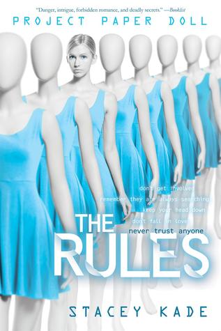
I love the change!
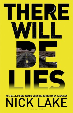
The black-white and yellow color scheme looks great.
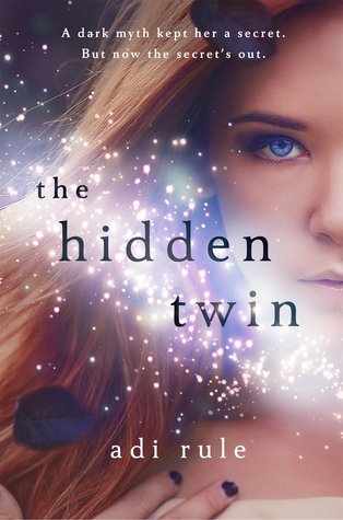
I like everything but the partial face.
Very fresh / light. I like it!
REDESIGNS
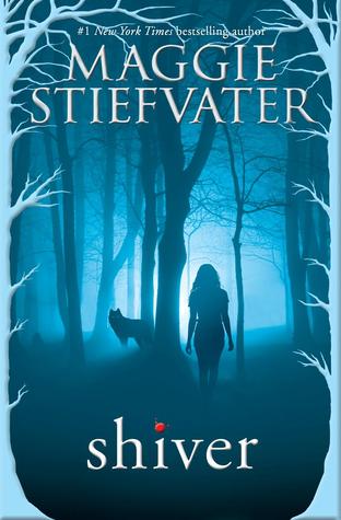
I like the new one slightly more.
I love the original more - it's simpler and not as busy-looking.
I like the font more in the new cover, but otherwise, I'm undecided.
The new cover is fantastic.
They capture different elements of the novel, but I think both are too lighthearted.
I prefer the original. It's classic, clean, and creative. The new version looks so average.
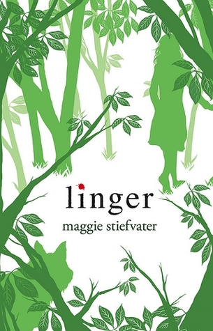
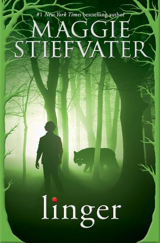
As with SHIVER, I prefer the original.
This is a very subtle, nice change.
I liked the original and it's subtlety, but the new one is eerily eye-catching.
MAYBE CHANGING?
I spotted the new image on Amazon, and I really hope that it is not the new cover. The first cover is fantastic and fits the story very well, so it would be a shame if they changed it.
What are your thoughts?