


(US hardcover, US paperback, UK paperback)
So much better than the first cover! I'm so glad they went with the UK cover. Although I still prefer the way the UK cover looks. I'm not fond of all that purple.


I loved the hardcover, so this is a bit sad. I think I would love the new cover if the couple on the front was gone or incorporated better.


The font is wicked (seriously, look at the "S" and the last "a"!). I love that it has color, but wish it wasn't purple.
GILT (revised, thanks to Katie's comment!)


(Hardcover / Original paperback design / Actual paperback design)
Whoa. The original paperback cover is one of those book covers that would make me feel very awkward in public. I like that it doesn't have the same pale-as-death skin tone as the original cover. As for the new paperback cover (and the one that will be printed), I like it. The warm colors, the background...it looks great!


I prefer the old cover. It's sleek, attention-getting. The new one is a bit too chaotic for me.


This is actually really close to the original cover...I kind of like the bright blue. I think I like both equally. Does her hair look less red?

I like the change. The new cover makes me very curious about the story, while the first cover didn't capture my interest at all.


I'm not really fond of either cover, but I can't stand the original, so I'm glad they're changing it. The new cover captures the darker side of the story in a more obvious way. But the original captures the bursts of humor, too. Darn.
CRANK


Definitely the original. It's simple, and it makes me curious. The new one makes me want to look away, the font is so distracting.
Just revealed on SHELF LIFE


I used to hate the original Anna cover (and probably never would have read that book if I hadn't received an ARC), but the adorableness has grown on me. The new cover is less embarrassing to read in public, but it wouldn't catch my eye if I was wandering around in a bookstore.


Yet again, the original cover has grown on me, so I prefer it more. I like the new LOLA cover better than the new ANNA. I love the warm colors.

It's okay. I'm not a big fan of font that takes over the cover, unless it's integrated in a unique way. I hope that they at least do something fun with the font for all three books (emboss, engrave, foil, something)!
All in all, while I love some of the new covers, I'm starting to think that I'm not really a cover-change fan. Sometimes they are absolutely incredible, but other times...not so much.
What are your thoughts?
O I honestly like them all! Except Lola. I'm undecided on that one.
ReplyDeleteGlad you like them all! I'm expecting that my opinion may change after some time. I tend to do that a lot with book covers, like how I used to hate the cover for THE SCORPIO RACES and now I adore it. I'm strange like that ;)
DeleteI'm a little disappointed with a few of these covers. I loved the original covers of Venom and Stephanie Perkins' books. I'm really upset with the changes to Anna and Lola and the new Isla cover. Oh well. Also, Gilt actually has another new cover. http://katherinelongshore.blogspot.com/2013/02/a-tale-of-three-covers.html
ReplyDeleteThanks for sharing!
I don't think the new ANNA, LOLA and ISLA covers are terrible, but I've come to adore the fun original ones. The old covers fit the novels so perfectly. I think the new ones will appeal to more readers, so at least that's good. But it sucks that ISLA won't match my signed ANNA and LOLA copies, though!
DeleteMy first thought when I saw the Stephanie Perkins covers was that Isla wont match with my Anna and Lola hardcovers so am disappointed. I really liked the orginal Seraphina cover too and wished they didnt change it to the purple color for the paperback.
ReplyDeleteI know, right? I always hate it when that happens. It makes the set look strange on my bookshelf when some books have different covers.
DeleteI would love and adore the SERAPHINA cover if it had any other color except for purple (and pink, b/c that would look ridiculous). The original is so striking, though!
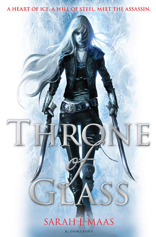
I like them all <3 Throne of Glass*_*
ReplyDeleteI really wish they'd NOT had a "fans of..." blurb on the new cover for Throne of Glass. I understand why, but I know that lots of people ended up expecting WAY too much of this book. When people compare to Game of Thrones, I think it's detrimental to the purpose.
ReplyDeleteI don't know what I feel about the new Venom cover. Something about it is off-putting.
I like the new Seraphina cover. It's lovely, but in the original the details come through MORE.
I didn't like either cover for Gilt. I wouldn't refuse to buy the new pb cover. If I owned either old cover I would have hidden it away, locked up, for ever. I hope the gold cover is shiny or has embossing or something.
I loved the original cover for Ripper. I don't understand the new one... I don't understand why they're re-covering it. Also I can't stop thinking the man is running through a ripped pair of jeans. XD
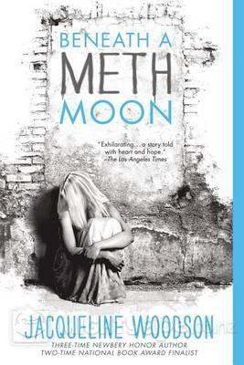
I think I prefer the new Rift cover. It's more striking, for me, and would easily catch my attention. I agree--the new Beneath a Meth Moon would get me to pick it up and see what it's about. I don't care for either cover for Devilish. I strongly dislike the new cover for Crank. Again, I don't understand the need for the change.
I like the new Stephanie Perkins book covers, but like you I grew accustomed to the old covers. They were sweet and cute and depicted very nicely what you could expect in the stories. I like the little icons though. :) [heart star rose]
It is too bad that the new Seraphina cover is purple. It could be awesome, but the purple and green makes it look like a photo negative. I am glad they re-did Beneath a Meth Moon and Gilt. The original covers were very meh. These ones pop more.
ReplyDeleteI just hate cover changes on principle. Well, only for series, really. Because it's the worst when you own the original covers and then they change them midway through the series. I agree with you about the original Anna covers... I have kind of a love/hate relationship with them. But the new covers don't particularly stand out to me... I'm kind of disappointed.
ReplyDeleteI think cover change is all about marketing. If someone likes the original cover best, then they'll have to pay the extra money for the hardcover. I don't mind when the change is small, like with Rift, but ... most of the time I don't. In the end, it doesn't really affect the book's content.
ReplyDeleteI don't know what I think about the new Stephanie Perkins book covers. I like them but I miss the cuteness in the old covers.
ReplyDeleteAgree on the purple. Not my favorite colour :S
ReplyDeleteThey changed the cover of Crank?! -.- I'm not okay with this.
ReplyDelete