Showing posts with label Andrea Cremer. Show all posts

Thursday, October 17, 2013

COVER REVEALS & REDESIGNS: STARGLASS, FIENDISH, and THE INVENTOR'S SECRET


Original MoS Hardcover

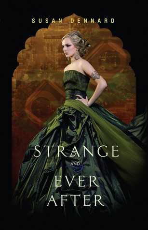
STRANGE AND EVER AFTER: I love the covers for this trilogy! Great titles, too. 
MAID OF SECRETS (paperback): I like the redesign a bit more. 


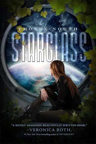
Original Hardcover

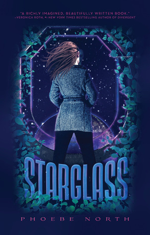
STARGLASS (paperback): I liked the original, but the brighter blues and greens on the redesign have won me over. I love the new font, too! 
STARBREAK: I really like this one, too.  


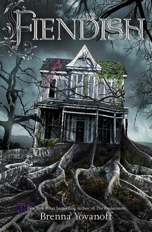
FIENDISH: Eerie! Creepy house, random flowers...it definitely stands out! 
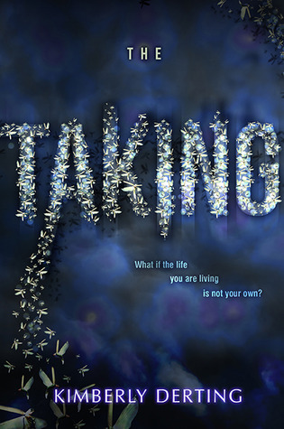
THE TAKING: Not too much going on, but the title looks great. 


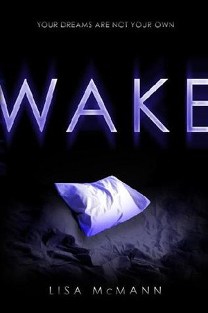
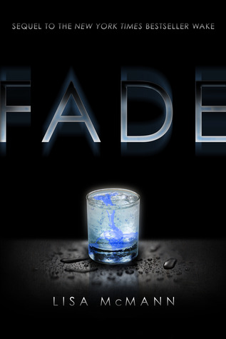
Original covers for this trilogy
  

DON'T CLOSE YOUR EYES (WAKE / FADE / GONE omnibus): The older covers are better and stand out more, in my opinion. But I haven't read these books, so maybe the new cover works. 


ON THE FENCE: A bit typical, isn't it? The book sounds great, though. 
ONLY EVERYTHING: This one is a bit strange...I'm curious to see what the novel is about. 


First Cover Design

THE INVENTOR'S SECRET: I like this design so much more than the heart! It's fantastic!

Have you spotted any fabulous covers lately? 


Friday, June 21, 2013

More New YA Cover Reveals

I know I posted some new YA covers earlier in the week, but it appears that this is an epic week of cover reveals, so here are a few more! 


FROZEN and ELUSION

(revealed on Publishing Crawl) (revealed on Epic Reads)


SIDE EFFECTS MAY VARY and NEARLY GONE

(revealed on Mundie Moms) (revealed on YABC)


So many fabulous covers! Have you spotted any great new YA covers?

Thursday, February 28, 2013

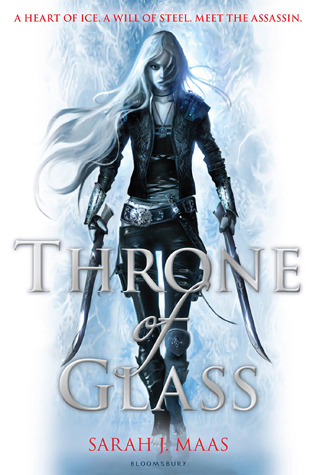
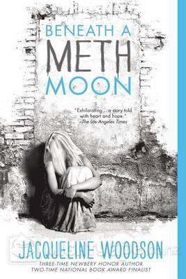
New Paperback Covers: Throne of Glass, Beneath a Meth Moon, Anna and the French Kiss and more

(US hardcover, US paperback, UK paperback)
So much better than the first cover! I'm so glad they went with the UK cover. Although I still prefer the way the UK cover looks. I'm not fond of all that purple. 

I loved the hardcover, so this is a bit sad. I think I would love the new cover if the couple on the front was gone or incorporated better.

The font is wicked (seriously, look at the "S" and the last "a"!). I love that it has color, but wish it wasn't purple. 

GILT (revised, thanks to Katie's comment!)
(Hardcover / Original paperback design / Actual paperback design)
Whoa. The original paperback cover is one of those book covers that would make me feel very awkward in public. I like that it doesn't have the same pale-as-death skin tone as the original cover. As for the new paperback cover (and the one that will be printed), I like it. The warm colors, the background...it looks great! 

I prefer the old cover. It's sleek, attention-getting. The new one is a bit too chaotic for me. 

This is actually really close to the original cover...I kind of like the bright blue. I think I like both equally. Does her hair look less red? 

I like the change. The new cover makes me very curious about the story, while the first cover didn't capture my interest at all. 

I'm not really fond of either cover, but I can't stand the original, so I'm glad they're changing it. The new cover captures the darker side of the story in a more obvious way. But the original captures the bursts of humor, too. Darn. 

CRANK
Definitely the original. It's simple, and it makes me curious. The new one makes me want to look away, the font is so distracting. 

Just revealed on SHELF LIFE

I used to hate the original Anna cover (and probably never would have read that book if I hadn't received an ARC), but the adorableness has grown on me. The new cover is less embarrassing to read in public, but it wouldn't catch my eye if I was wandering around in a bookstore. 

Yet again, the original cover has grown on me, so I prefer it more. I like the new LOLA cover better than the new ANNA. I love the warm colors. 

It's okay. I'm not a big fan of font that takes over the cover, unless it's integrated in a unique way. I hope that they at least do something fun with the font for all three books (emboss, engrave, foil, something)! 

All in all, while I love some of the new covers, I'm starting to think that I'm not really a cover-change fan. Sometimes they are absolutely incredible, but other times...not so much. 

What are your thoughts? 

Thursday, February 14, 2013

COVERS: Star-Swept Seas, Dream Thieves, and Tandem

I'm pretty much obsessed with book covers (especially reveals!), and these past couple weeks haven't disappointed with the reveals of so many new covers. Check out some below:

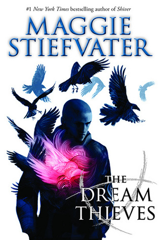
         ACROSS A STAR-SWEPT SEA                            THE DREAM THIEVES                      
Like the first cover, and love the Stiefvater cover!! 

INFINITYGLASS                                                 TANDEM
That red pops! And I adore the cover for TANDEM! So simple yet intriguing. 

INHERITANCE                                                        ICONS
 
INHERITANCE looks okay (nice, but not eye-catching). ICONS is fascinating. 

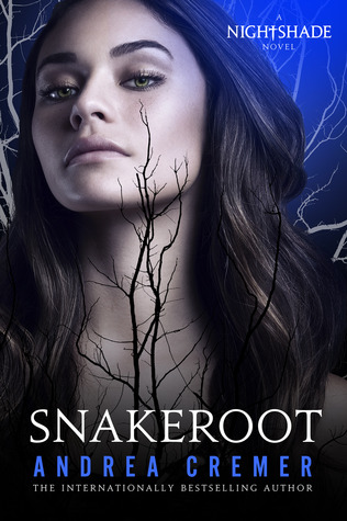
          SNAKEROOT                                       THE DISENCHANTMENTS
 
I hate SNAKEROOT's cover. I adore the new one for LaCour's novel - it fits the story perfectly!

(Image from USA TODAY)
I have mixed thoughts (it looks great, but am I the only one who thinks Hagrid's head looks unnaturally small for his body? He just doesn't quite look right...I love all the details, though). I'm curious if the font will actually be white, or if they're using some sort of foil....

What new covers have you spotted? 

Signature