Original MoS Hardcover
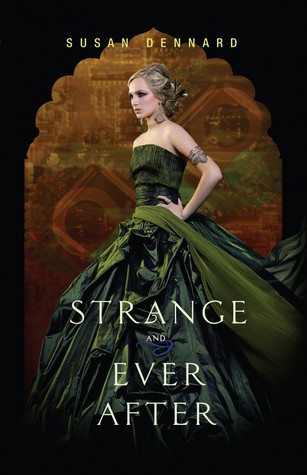
STRANGE AND EVER AFTER: I love the covers for this trilogy! Great titles, too.
Original Hardcover
STARGLASS (paperback): I liked the original, but the brighter blues and greens on the redesign have won me over. I love the new font, too!
STARBREAK: I really like this one, too.
FIENDISH: Eerie! Creepy house, random flowers...it definitely stands out!
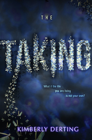
THE TAKING: Not too much going on, but the title looks great.
Original covers for this trilogy
DON'T CLOSE YOUR EYES (WAKE / FADE / GONE omnibus): The older covers are better and stand out more, in my opinion. But I haven't read these books, so maybe the new cover works.
ON THE FENCE: A bit typical, isn't it? The book sounds great, though.
ONLY EVERYTHING: This one is a bit strange...I'm curious to see what the novel is about.
First Cover Design
THE INVENTOR'S SECRET: I like this design so much more than the heart! It's fantastic!
Have you spotted any fabulous covers lately?












Such a shame that they changed the cover for The inventor's secret; I loved the heart! But I'm happy it works for you and they kept it in the same style, so I can get used to it. I love the redesign for Maid of secrets and Brenna Yovanoff always gets the best covers :D
ReplyDeleteMel@thedailyprophecy.
The redesign for MoS is much better! Agreed about Yovanoff's works, they always have such great and eerie covers :)
DeleteO
ReplyDeleteOooo
Oooooooo
I love the font on Only Everything.
It does have nice font!
DeleteOhhh....I feel like I have been so out of it since I have been moving/unpacking, so a lot of these books are new to me. I have been adding them all to my TBR shelf. Thanks for sharing them with us! Anyway, I LOVE the cover of Maid of Secrets (def. better than the original) as well as On the Fence--screams summertime read! :)
ReplyDeleteThe new MAID OF SECRETS cover is absolutely better than the original - it makes me more curious about the story.
Delete"On the Fence--screams summertime read" -- Agreed!
I quite like the new cover for Maid of Secrets-I didn't really like the single girl before even with the dagger gleaming.
ReplyDeleteThe original cover was a bit strange. I'm definitely more fond of the new cover!
DeleteI like the redesign for Maid Of Secrets much better ;)
ReplyDelete-Scott Reads It!
Agreed!
Delete