

I love the change!

The black-white and yellow color scheme looks great.
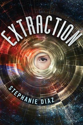
I like everything but the partial face.

Very fresh / light. I like it!
REDESIGNS


I like the new one slightly more.


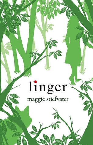
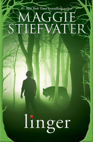
I love the original more - it's simpler and not as busy-looking.


I like the font more in the new cover, but otherwise, I'm undecided.


The new cover is fantastic.


They capture different elements of the novel, but I think both are too lighthearted.

I prefer the original. It's classic, clean, and creative. The new version looks so average.
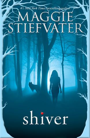
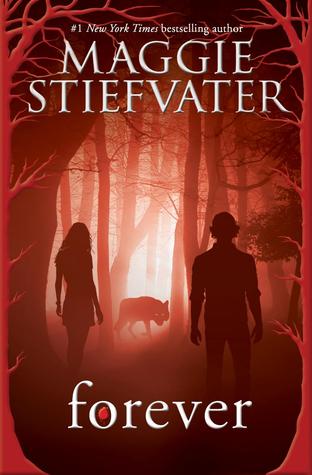
As with SHIVER, I prefer the original.


This is a very subtle, nice change.

I liked the original and it's subtlety, but the new one is eerily eye-catching.
MAYBE CHANGING?


I spotted the new image on Amazon, and I really hope that it is not the new cover. The first cover is fantastic and fits the story very well, so it would be a shame if they changed it.
I definitely prefer the original covers for the Wolves of Mercy Falls book and I like the original cover for The Book of Broken Hearts. The guy on the new one looks way too old.
ReplyDeleteI love the new cover for Sabriel. The cover for Catherine reminds me of Katie McGarry's books so it will probably draw in a greater readership.
He does look a little too old, doesn't he?
DeleteOoh, yes, I can see the Catherine / Katie McGarry connection. Definitely a similar look!
I prefer the original covers for Shiver as well. Not a big fan of the redesign! I actually really like the new cover for Catherine-- awesome! Thanks for sharing these with us!
ReplyDeleteThe old SHIVER covers were fantastic! I don't get why they are changing.
DeleteIt's not that I don't like the new cover for Sabriel but I'm so used to the old cover and it feels sort of iconic to me that I don't like it as much as I could.
ReplyDeleteI can understand that - I'm still very attached to the original cover for THE GIVER by Lois Lowery, even though the new ones are nice too.
DeleteWith Blind Spot, Catherine, and Far Far Away I think I like the originals better. But with all the others I think I dig the new ones. Thanks for sharing doll!
ReplyDeleteI'm amazed that BLIND SPOT is changing - why change a perfectly good cover?
DeleteAwesome covers :D I too prefer the new cover for Nil ;p Thank you for sharing. <3
ReplyDeleteThe new NIL cover is great! It makes me more interested in the story.
DeleteThank you for stopping by! :)